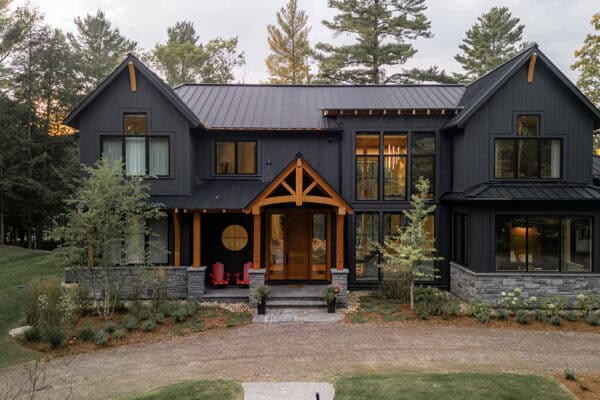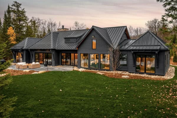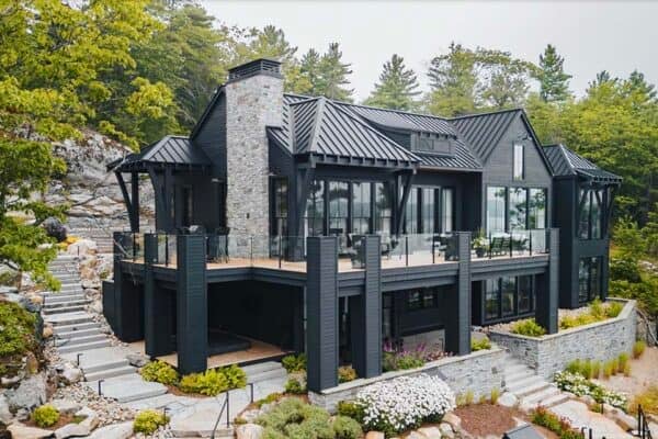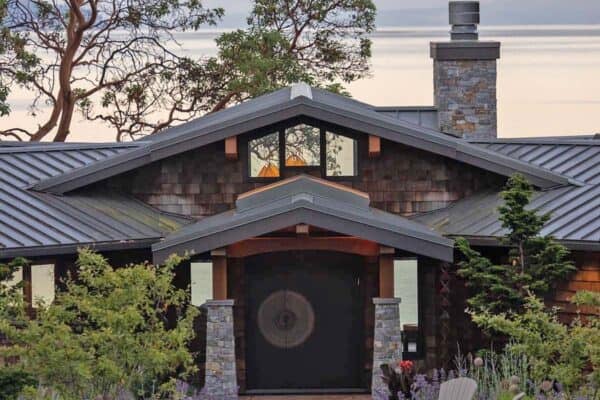

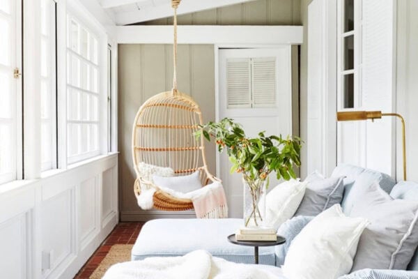


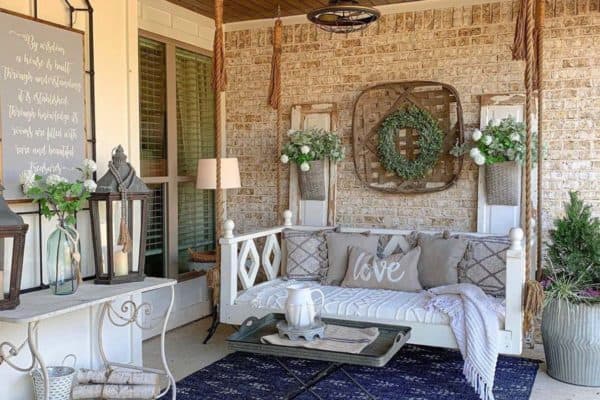

Sophie Clapperton Designs was responsible for the architectural and interior design of this black cottage nestled along the coveted Walkers Point shore of Lake Muskoka, Ontario, Canada. This transitional-style masterpiece was designed for summer living, entertaining, and creating lasting memories. The exterior of this lake house combines charcoal siding, a black metal roof, and natural […]
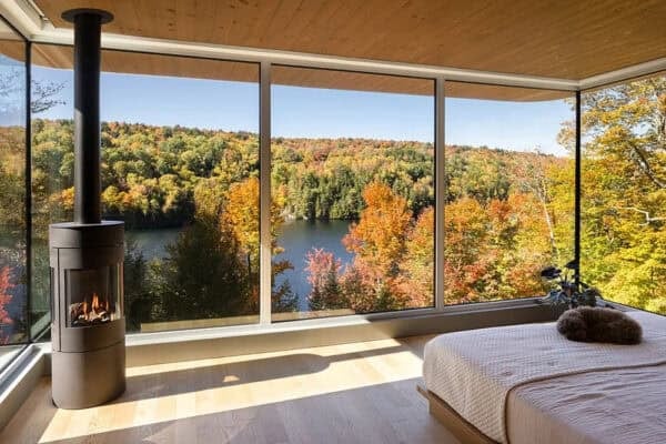
Tour this Canadian lakefront cottage with amazing views of Lake Muskoka